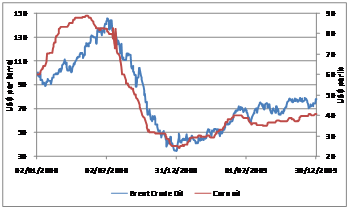
WTI and Brent

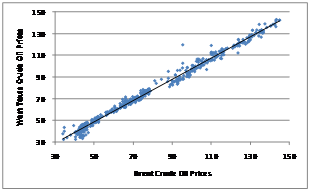
Scatter plot – Brent and WTI
- Form: Linear
- Strength: Very clear fit of data to a non-horizontal straight line. High concentration of points around the line of best fit indicates strong relationship.
- Direction: Positive incline from left to right
- Outliers: No significant deviations.
Brent and Fuel Oil
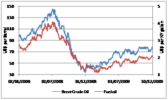
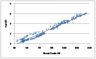
Scatter plot – Brent and Fuel Oil
- Form: Linear
- Strength: Clear fit of data to a non-horizontal straight line. High concentration of points around the line of best fit indicates strong relationship.
- Direction: Positive incline from left to right
- Outliers: No significant deviations.
Brent and Natural Gas
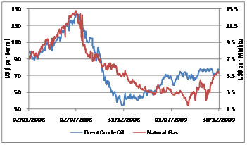
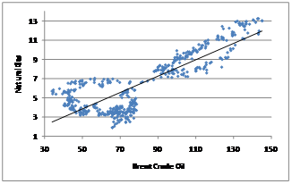
Scatter plot – Brent and Natural Gas
- Form: Linear
- Strength: A relatively clear fit of data to a non-horizontal straight line. Concentration of points around the line of best fit indicates a high correlation however there areas in the plot showing that the data points are more widely spread out as compared to the commodities discussed earlier.
- Direction: Positive incline from left to right
- Outliers: No significant deviations.
Brent and Corn Oil
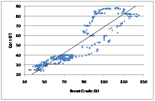
Scatter plot – Brent and Corn Oil
- Form: Linear
- Strength: The non-horizontal line of best fit indicates that a linear relationship exists between the two commodities. There is a greater dispersion of points at higher prices.
- Direction: A positive incline.
- Outliers: No significant deviations.
Brent and Soybean Oil
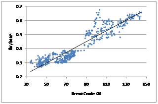
Scatter plot – Brent and Soybean Oil
- Form: Linear
- Strength: The non-horizontal line of best fit indicates that a linear relationship exists between the two commodities. The concentration of data points around the line of best fit suggests a high correlation.
- Direction: A positive incline.
- Outliers: No significant deviations.
Brent and Palm Oil
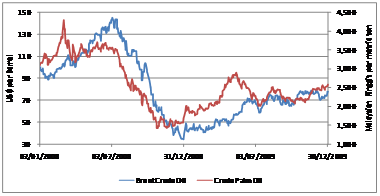
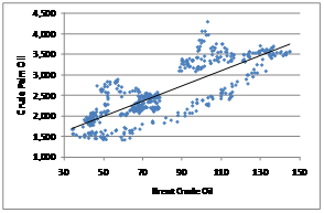
Scatter plot – Brent and Palm Oil
- Form: Linear
- Strength: The non-horizontal line of best fit indicates that a linear relationship exists between the two commodities. The concentration of data points around the line of best fit suggests a high correlation
- Direction: A positive incline.
- Outliers: No significant deviations.